

Graphic research and artistic direction
This project presented me with an exciting challenge: how to differentiate myself in a highly visual field? Diners, burgers, neon signs, there are hundreds of them.
So I decided to:
Going back to my roots, diving into the visual archives of American diners, rather than relying solely on Pinterest or Behance,
Build a modular graphic grid, which can be adapted to the map, placemats, social networks, signage, etc.
This artistic direction is designed as a visual ecosystem, coherent, modular and resolutely immersive.

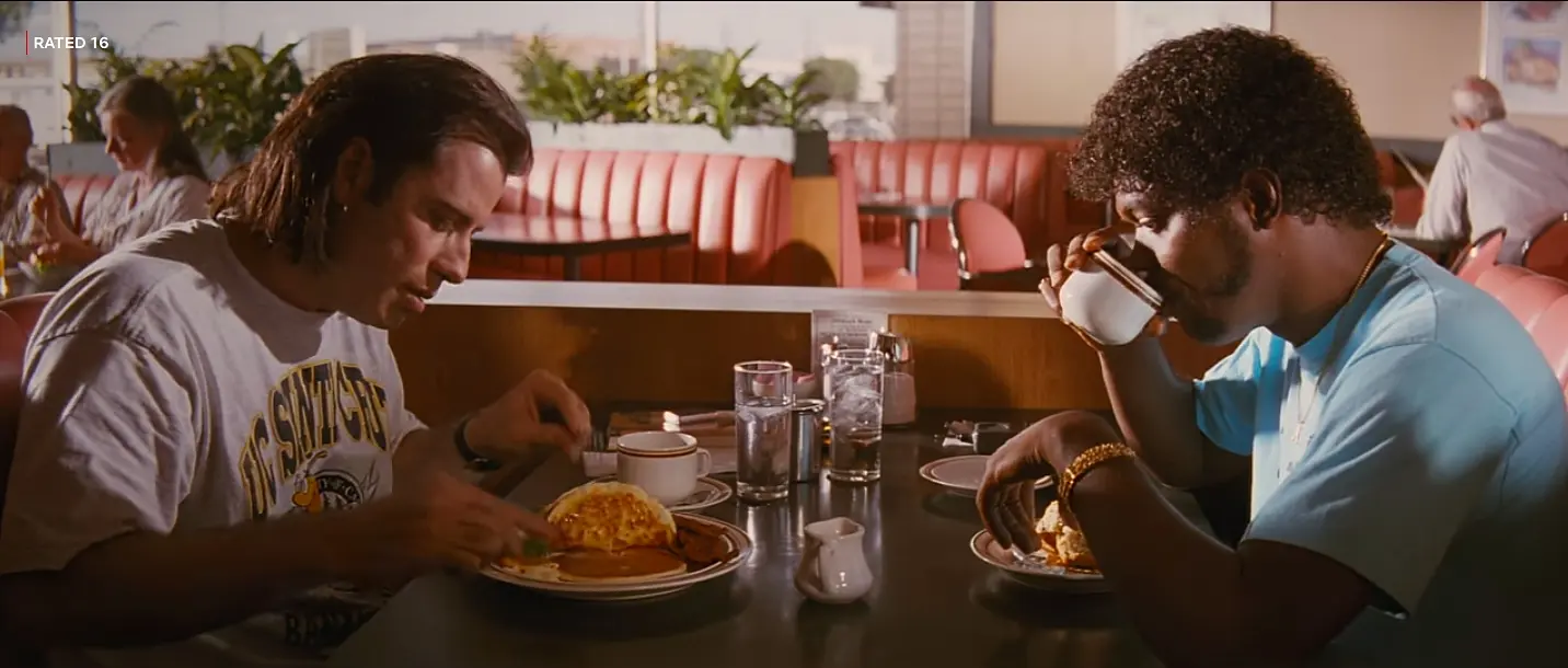
Jack Rabbit Slim's
Dyana BCH Design - 2024

The burger has been an American restaurant staple since 1983. Nestled in the heart of New York City, this iconic diner is more than just a place to eat; it's a true journey through time, where '80s nostalgia meets the timeless conviviality of a meal with family or friends.
The moment you walk through the doors of Jack Rabbit Slim's, you're transported to a bygone era, where jukeboxes blare with rock 'n' roll classics and shimmering neon lights illuminate the warm and lively atmosphere. The laid-back, retro vibe invites you to relax and enjoy a moment of pure pleasure.
When I imagined Jack Rabbit Slim's, I wanted to create more than just an American diner concept. I sought to build an immersive brand, capable of telling the story of an era and awakening a certain form of nostalgia: that of the 80s, American pop culture, rock 'n' roll, cult films, and neon-lit diners.
The challenge was twofold:
Create a strong identity in a saturated market (burger joints),
And offer a sensory and emotional experience that is consistent between the location, the logo, the menu and the communication universe.


Why a rabbit? And why chic?
The name “Jack Rabbit Slim's” is a direct reference to the film Pulp Fiction, to the cult retro diner scene. This nod immediately fuels the cinematic and referenced dimension of the project. The rabbit embodies speed (like the service of a diner), playfulness (the tone of the place) and a form of universal sympathy . Here, it becomes the natural mascot of the brand.
Dressing it in a bow tie was an obvious choice because it adds a touch of refinement, a form of vintage elegance like waiters in uniform, dance parties or dinners that are more “classy” than they appear.
This contrast (playful animal + chic decor) creates an interesting graphic tension: it's a cool, fun place, but one that takes its image seriously.
This logo isn't just an image; it's a character. It carries the brand, can be used across different media (signs, packaging, merchandise, social media, etc.), and embodies the brand's spirit in the long term.

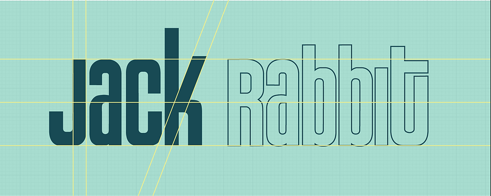
Custom logo typography: for a unique signature

In a world as visual as the restaurant industry, typography is a voice. So I chose not to use an existing font, but to create an original typography, inspired by the neon signs of the 80s and the hand-painted lettering found in diners.
This typography:
The name "Slim's" plays on generous and welcoming curves,
Incorporates retro details, like stylized serifs
And most importantly, it is 100% bespoke, ensuring that the brand remains distinctive and does not get diluted by current trends.
J’ai donc pris le parti de :
-
Revenir aux racines, en plongeant dans les archives visuelles des diners américains, plutôt que de me baser uniquement sur Pinterest ou Behance,
-
Construire une grille graphique modulaire, pouvant être adaptée à la carte, aux sets de table, aux réseaux sociaux, à la signalétique...
Cette direction artistique est pensée comme un écosystème visuel, cohérent, modulable et résolument immersif.
Menu

With Jack Rabbit Slim's, I wanted to prove that branding isn't just about a logo, but about a brand experience thought out down to the smallest detail. From the idea to the visual, from the symbol to the tone of voice, each element is the result of strategic and creative thinking.